The most creative law firm websites 2020
Last modified
When you think of corporate law firm websites, the term "creative" does not necessarily come to mind. This is a category of website design that does not evolve as quickly as others. Nevertheless, we have scoured the net to compile a shortlist of law firm websites that stand out and go against the grain in the best possible sense. (Please note: We have deliberately excluded law firm websites which we have had a hand in designing and developing in order to bring you our most objective shortlist.)
1. Kasowitz Benson Torres

We appreciate the theatrical nature of the Kasowitz Benson Torres website – think, film noir meets cigar lounge meets boxing ring. The site makes use of a black and white palette (with touches of colour), provocative conceptual imagery and striking headline copy. The overall effect is bold and forceful, yet thoughtfully so.

What is additionally notable is the way the menu leads with the word “clients” (routing to client case studies) as opposed to the firm’s own people and expertise pages. This gives the impression of a firm that is strategically customer and results-focused.

We appreciate the use of tagline copy in lieu of practice photography on expertise detail pages as a means of standing out. Here are examples of impactful taglines the site features:
- Corporate: Tactical dealmaking
- Commercial: Commanding the courtroom
- Antitrust: Mastering the competition
- Intellectual property: Fiercely protective
Overall, this is a great example of a cohesive design driven by a distinctive aesthetic and a clear point-of-view.
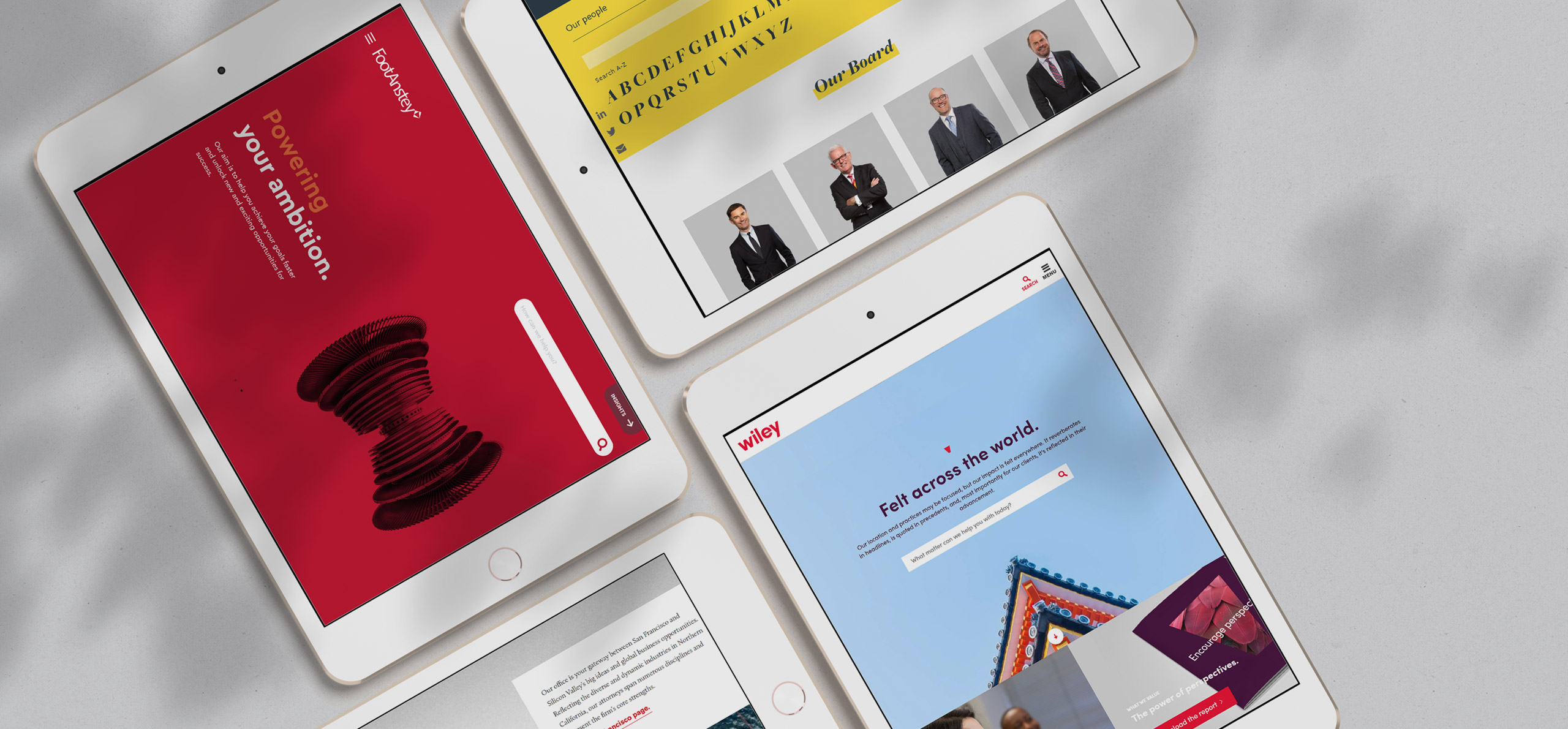
2. FootAnstey

The FootAnstey website design is a breath of fresh air, characterized by bright colours, clever copy and striking conceptual imagery.

The site makes use of clean navigation, big blocks of colour and ample white space.

We particularly appreciate the use of unstilted profile photography on lawyer detail pages.

The inclusion of interactive diagrams and accordion elements on insights pages is a high-tech touch, reducing the volume of static text readers typically need to wade through.
The site, in summary, feels dynamic and technically polished.
3. Arent Fox

The Arent Fox website design is notable for its bold use of photography, including full screen news blocks featured on its perspectives landing page.
Side note: The label “perspectives” is a clever alternative to standard “news” or “insights” designations. Other law firms have resorted to the following creative labels for this content category:
- Our Thinking or simply, Thinking
- Real Ideas
- Thought Leadership

Services pages on the Arent Fox site are characterized by striking banner photography, strong copy and clever accompanying taglines. Here are just a few example taglines we love:
- Finance: We love higher math
- Real estate: From dirt to development, we know deals
- Cannabis: We cut through the haze
- Advertising and promotions: We write the fine print
- Sports: We have your playbook

Creative image collages used to feature office locations are particularly striking, as is the general concept of dynamic text and media layering. The site, as a result, feels sharp and energetic.
4. Howard Kennedy

The creators of the Howard Kennedy site understand that the general web user is allergic to static text, especially reams and reams of it. Here is a site that follows a strategic approach to its content flow, dividing text into easily digestible and visual components. The result is a delight to navigate.

Practice pages, for example, feature details on related services, recent experience, team and news in a visual manner with toggle functionality to expand more content.

Image choices throughout the site are fresh and unclichéd – such as cutlery used to represent family law.

Fun “did you know” details on lawyer hobbies or prior career paths liven up legal profile pages and double up as a conversation starter.
5. Wiley

The recently revamped Wiley website feels lively, focused and collegial, boasting modern typography sets and a striking colour palette of purple-magenta, red, cream and grey.


A triangular brand mark is used as a consistent design element to tie together digital and print design materials. Images are sparingly applied and tend towards the abstract conceptual.
This is a site that feels current and very much in touch with the times.
6. Gately

Who knew that dark grey and yellow would look so smart together? This unusual colour palette, combined with bold typography choices, gives the Gately site the visual edge.

Colour (in the form of content highlights and quote blocks) is used to break text into manageable portions, while imagery is applied in a restrained but tasteful manner. The site, in summary, feels honed and classical.
7. van Cutsem Wittamer Marnef & Partners


The van Cutsem Wittamer Marnef & Partners website has a tailored, high-end feel to it. What stands out is the finesse applied to the relative proportion of design elements and the high attention to detail.

Page transitions are thoughtfully animated, including button hovers, forms and toggle effects.
8. Axiom


Axiom has always been at the cutting edge in terms of law firm website design. The site in its latest incarnation makes use of an orange, grey and white colour palette, memorable video content, clear calls-to-action on every page and frequent supplementary stats.

Text content is divided into easily digestible chunks with accompanying imagery and iconography. Here is a site where the quality of the copywriting is as notable as the quality of the design.
Conclusion
The above are all examples of law firm websites that have received some TLC recently. A typical recommended website revamp cycle is every 3 to 5 years, to keep in touch with the times.

We specialize in web development for professional services firms. Contact us to discuss your next project.