The best law firm websites of 2022
Last modified
To ensure your website remains in touch with the times, it is important to refresh it every three to five years. Here are examples of law firm websites that have done exactly that.
As in our 2020 list, we have excluded websites we have worked on, to give you our most objective shortlist.
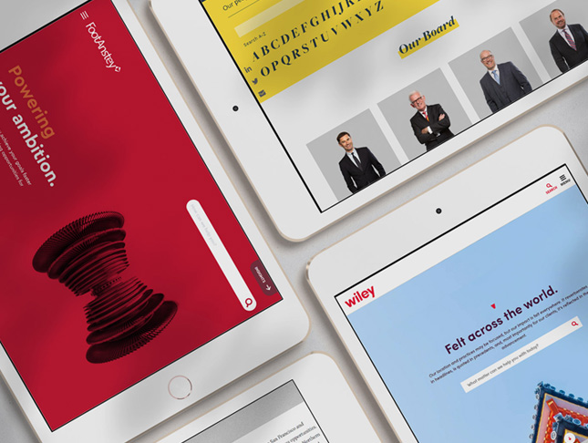
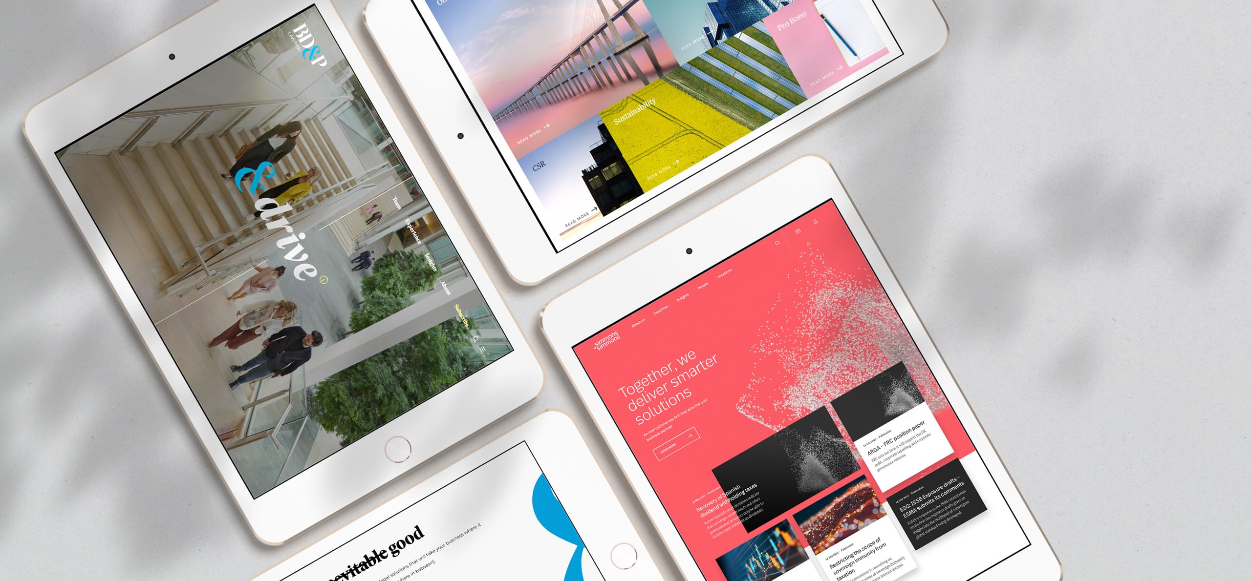
1. Simmons & Simmons
The Simmons & Simmons web presence was recently revamped following a firm-wide rebrand. The new site feels dynamic, agile and aesthetically cohesive. We particularly appreciate the unusual coral and charcoal colour palette, combined with asymmetrical grid layouts as applied to news cards.

The site uses imagery sparingly, but has a clear philosophy driving the selection of visuals. The focus on CGI and futuristic imagery evokes data in motion, synapses in the brain, murmurations in nature and a sense of collaboration. The site copy further underlines this focus on partnership:
- “Together, we deliver smarter solutions” and
- “An international law firm that acts like your business partner”

As one would expect from a site of this calibre, expertise and people pages avoid the pitfalls of static text by taking users through a visual “tour” of content components – from “overview” to “experience”, to “key contacts”, to “insights”.

Not only does the site highlight services and sectors, it also features an aggregated products dashboard, further emphasizing the firm’s focus on technology and innovation. These product pages feature video content to explain complicated legal concepts in an accessible manner.

In summary, the revamped Simmons & Simmons website gives the impression of a law firm at the cutting edge, with a specific focus on the intersection of technology and collaboration.
2. BD&P
The revamped BD&P website was launched in June 2022. The bold use of serif typography, striking full screen imagery and clever colour accents make this site design particularly refreshing.


Expertise pages are notable for the way they present text in easily digestible content components (such as: "overview" with client testimonials, "representative work", and "contacts") rather than an overwhelming wall of static text. Each page ends with a prominent “how can we help?" call-to-action.


Refreshingly, team profile photography features different colour backgrounds for each person, giving the impression of a firm that places diversity and inclusion at the fore. Profile photography comes across as natural and unstilted.


In summary, the revamped BD&P site gives the impression of a law firm that is dynamic, nimble, personable and in touch with the times.
3. Bird & Bird
The revamped Bird & Bird website is notable for its “non-lawyery” colour palette, replete with pastel blues, pale pinks, vivid greens and bright yellows. The theme of “curious connections” (based on the ampersand logo mark) runs through print and web materials, together with image concepts that feel fresh and unclichéd.


We love the “fun facts” icons that are included in the footer of lawyer profile pages, from “alternative career” to “interests” to “favourite place” and “most used tech”. This approach adds a personal touch to an otherwise impersonal medium.

The insights section of the sites aggregates content into “trending topics” as an additional means of navigation. Each trending topic has a separate landing page with related insights, podcasts, videos and key contacts. Notable too is the site’s emphasis on video content, with a full “Two Birds TV” video channel.

In conclusion, the revamped Bird & Bird site reflects the firm’s curious, quirky brand personality, and stretches the boundaries of what is deemed possible when it comes to law firm web design.

Did you know? We specialize in web development services for professional services firms. Contact us to discuss your next project.
4. Kirkland & Ellis
The Kirkland & Ellis website follows a crisp, clean aesthetic, made coherent through the repeated use of angular, animated design elements.


The site is notable for its clean navigation, muted colour palette, bold serif typography, as well as minimal yet thoughtful application of imagery.


5. Davis Polk
Lastly, the Davis Polk website is striking for its complete absence of imagery (excepting, of course, profile photography). Instead, colour and typography take centre stage.


The site is clear and simple to navigate, while the use of vertical text labels adds a surprising touch. The overall effect is bold, clean and assertive.

Conclusion
In conclusion, law firm web design does not have to be staid. The use of unconventional colour palettes can help stand out against a "blue-grey" sea of sameness. A clear point-of-view applied to the choice of imagery (or the complete absence of imagery) can help define the visual language for a site. Above all, navigation should be clear and intuitive, while text content should be visualized, where possible, and presented in easily digestible content components. Contact us below to discuss your next website revamp!
We specialize in web development for professional services firms. Contact us to discuss your next project.