Insights from the usability classic 'Don’t Make Me Think' by Steve Krug

Last modified
Steve Krug’s book “Don’t Make Me Think: A Common Sense Approach to Web Usability”, originally published in 2000, is considered a classic in user design circles, notable for its distilled wisdom, quirky humour and droll illustrations.
With the burgeoning of the UX industry since the book’s initial publication, the ideas outlined in the book are not as novel today as they were several years ago. Nevertheless, it is always helpful to be reminded of “evergreen” usability principles and the importance of frequent user testing. These evergreen principles are summarized below.
“Don’t make me think.”
The average web user is busy, distracted and in a hurry. For this reason, websites should be self-evident, obvious and self-explanatory. Users should be able to land on any page of a site and answer the following key questions with minimal cognitive strain:
- Whose site is this?
- What is the purpose of the site?
- What page am I on?
- What can I do here?
This is achieved by applying web conventions that have stood the test of time – a left-positioned site logo with accompanying tagline, logical navigation labels and the use of well-known iconography. There should be no “learning curve” to navigating a site.
Site owners thwart the principles of usability when they apply unusual navigation labels (for example, “Quick find” instead of “Search”), obscure icons that are harder to interpret, confusing button text or links that are not obviously clickable. These deviations all require more cognitive effort to interpret, distracting users from the task at hand.
We don’t read web pages. We scan them.
![]()
Site owners often assume their visitors study web pages as carefully as they consume a work of fiction. In reality, however, users consume web pages in the same chaotic way they consume “a billboard at 60 miles an hour”.
For this reason, web page design should take inspiration from billboard design – presenting content in a manner that is easy to parse at speed.
Here are ways to achieve this:
- Pages should be designed with a clear visual hierarchy in mind. Important elements should be large and distinctive, while related elements should be visually connected.
- Content should be formatted in a manner that supports scanning. This involves ample use of headings, formulated to give users an instant overview of the content structure of a page.
- The remaining content should be divided into short paragraphs of text for ease of scanning.
- Additionally, anything that can be bulleted, should be bulleted.
The design of “Don’t Make Me Think” echoes these general design principles with generous use of headings, ample bulleting, short paragraphs and succinct chapters:
Test frequently. Test small.

Krug emphasizes the importance of frequent user testing to identify and patch usability issues on a site. In contrast to popular belief, usability testing does not require large teams or extensive budgets, but can be done entirely in-house with available technology.
Krug recommends monthly user testing with three test participants. These users are recorded while navigating your site and completing a few tasks. The following test structure is recommended (see an example usability test in action):
- Welcome. Begin by explaining how the test will work. Krug provides a sample usability script here.
- Initial questions. Next, ask the participant a few questions about themselves for record purposes (age, gender, occupation, level of tech-savvy).
- Home page review. Then open the home page of the site and ask the participant to tell you what they think of it, what grabs their attention, what the site is for and what they think they can do here.
- Tasks. The heart of the test should consist of giving user a series of tasks to complete (such as: creating an account on the site, purchasing a product, or leaving a review) while thinking aloud.
- Probing and wrap-up. Finish with any final clarifying questions (such as: "What made you do X or Y?" or "What is the most important thing you think we should fix on the site?").
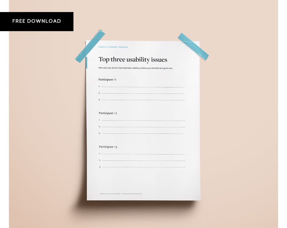
After reviewing recordings of each test, Krug recommends that site owners identify the top three usability problems experienced by each participant. Download our template here:
Next, set priorities in terms of the issues to be addressed on the site.
You’ll always find more problems than you have the resources to fix, so it’s very important that you focus on fixing the most serious ones first." - Stever Krug
When resolving usability issues, it is important to resist the impulse to add things to a site. Often, site owners will be tempted to add instructions to a page or additional explanations to solve usability issues. Very often, however, the right solution is to re-design a feature, clarify existing wording or remove elements that are distracting users.
Conclusion
Despite its age, “Don’t Make Me Think” is a good primer (and reminder) on the guiding principles of web usability for site owners and the importance of frequent user testing. For those wishing to dive deeper, Krug recommends the following additional reading:

We specialize in custom web design and development. Contact us to discuss your next project.